
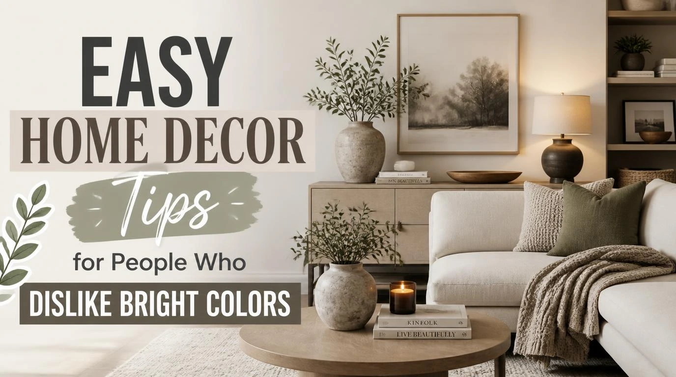
Finding easy home decor tips for people who dislike bright colors feels impossible when design feeds push neon rugs and loud accent walls. Walking into a highlighter-toned living room instantly sets my teeth on edge. You do not need electric greens or sunny yellows to make an apartment look stylish. A muted palette brings genuine peace, grounding your mood the second you toss your keys onto the table.
1. Layer heavy tactile fabrics for quiet depth
Flat beige rooms feel like doctor waiting rooms when you forget to vary your surfaces. Pulling together chunky wool throws, rough Belgian linen pillow covers, and washed velvet cushions creates instant visual interest without shouting. The contrast between rough and smooth surfaces tricks the eye into seeing rich complexity.
I swap standard poly-blend couch pillows for slub linen covers from Etsy every autumn. The natural wrinkles catch the afternoon sunlight and create shadows that replace the need for vivid pigments. Your seating immediately feels welcoming and lived-in rather than sterile.
2. Bring in aged brass and blackened iron
Polished chrome can read cold and sterile across an all-neutral space. Swapping out your cabinet hardware or floor lamps for living finishes gives the entire room an anchor. Warm metals bounce soft light across matte walls, adding a cozy glow that keeps neutral rooms from feeling lifeless.
Look for unlacquered brass switch plates or a blackened iron lamp base at local flea markets. These dark accents break up vast stretches of cream or gray. They behave like punctuation marks on a blank page, giving your eyes a deliberate place to rest.
3. Focus on rich wood grain patterns
Wood surfaces provide organic movement that paint simply cannot replicate. A dining table cut from white oak or dark walnut carries natural swirling lines that fill empty visual space. These organic patterns give a room soul without forcing you to look at a single neon hue.
Skip particle board veneers and hunt down solid wood side tables with visible knots. Treating raw wood with clear matte finishing oil preserves the authentic grain without creating a plastic sheen. The subtle honey or espresso tones will naturally warm up cold drywall.
4. Style surfaces with unglazed stoneware
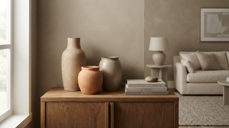
Glossy ceramic vases reflect too much harsh glare across a subdued space. Matte pottery, unglazed terracotta, and rustic clay vessels absorb daylight, creating a soothing, earthy focal point. Grouping three vessels of varying heights on a credenza gives you a finished look in seconds.
Scour thrift shops for vintage crock pots, chalky jugs, or speckled clay bowls. When executing easy home decor tips for people who dislike bright colors, choosing porous stoneware vessels keeps tabletops grounded. Pop an empty, raw clay jug on your console table and notice how quickly it softens the surrounding area.
5. Easy home decor tips for people who dislike bright colors rely on raw stone
Polished white marble can look stiff, but tumbled travertine and limestone feel grounded and ancient. A thick travertine coaster set or a rough-edge marble tray introduces sculptural weight to coffee tables. The tiny pits and fossils inside the stone supply endless detail without introducing chaotic hues.
Grab a small honed limestone tray to corral your daily pocket items or TV remotes. The subtle taupe and sand variations blend smoothly into any muted setup. It delivers an upscale look while keeping the overall palette completely subdued and peaceful.
6. Introduce sculptural branches over cut flowers
Bright floral arrangements pull focus the second you walk through the doorway. Long, architectural branches offer dramatic height and graceful silhouettes without forcing hot pinks or bright reds into your sanctuary. A single leafy olive branch or dried eucalyptus stem lasts weeks longer than grocery store bouquets.
Clip two long stems from an outdoor pear or magnolia tree and drop them into a tall jug. Keeping stems in an opaque ceramic vase hides murky water and emphasizes structural silhouettes. You gain fresh life and movement while keeping your aesthetic undisturbed.
7. Hang deeply textured paper and tonal artwork
Blank white walls make a color-free room look unfinished or abandoned. Choosing oversized wall art that focuses entirely on plaster ridges, charcoal sketches, or torn watercolor paper adds drama. The shadow lines cast by heavy texture do the heavy lifting that saturated paint usually does.
Frame an inexpensive sheet of handmade Japanese paper inside a dark oak frame. Opting for plaster relief art adds tactile dimension that shifts subtly as daylight moves across the room. You end up with a high-end gallery feel that remains wonderfully easy on the eyes.
8. Swap hard overhead lights for warm low lamps
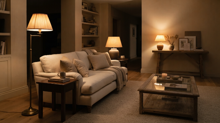
Harsh overhead ceiling fixtures wash out neutral spaces, flattening subtle textures into boring slush. Placing lamps at various heights around the room creates cozy pockets of amber light that highlight your decor materials. Table lamps paired with floor uplights turn quiet spaces into inviting evening retreats.
Screw warm-white 2700K smart bulbs into every lamp base throughout your living area. Fitting lamps with pleated linen lampshades diffuses harsh glare into a warm, creamy glow. You will notice your beige or gray walls suddenly gain a cozy, fireplace-like radiance.
9. Roll out thick woven natural fiber rugs
A bare hardwood floor can feel slippery and echoey when you strip away colorful accent rugs. Laying down a chunky wool loop rug or a thick bleached jute foundation immediately tethers the furniture together. The tight weave feels fantastic under bare feet and absorbs room echo instantly.
Pick a thick chunky wool rug featuring a subtle ribbed or diamond weave. These subtle shifts in pile height catch ambient shadows throughout the afternoon. Your room immediately gains warmth and comfort without a drop of vibrant dye.
10. Install textured wall treatments like limewash
Standard flat latex wall paint can leave neutral rooms looking flat and uninspired. Brushing on limewash or Roman clay introduces chalky, suede-like movement that mimics old-world European stone. The gentle clouding effect brings life to plain walls while maintaining an ultra-subdued palette.
Pick a soft greige or pale oatmeal shade for a dedicated bedroom accent wall. Applying authentic mineral limewash paint with a wide cross-hatch brush creates deep, cloudy undertones. The walls look rich and velvety rather than cold, clinical, or stark.
11. Choose smoked and fluted glassware
Clear glass disappears, but bright colored glass dominates a neutral tabletop way too aggressively. Smoked charcoal, amber, or ribbed glassware offers a moody middle ground that catches light beautifully. Fluted ridges scatter reflections across your dining table or open kitchen shelving.
Stock your bar cart with a pair of ribbed smoke tumblers beside an amber glass decanter. The deep tint adds contrast against pale stone counters without bringing loud color into the kitchen. It looks intentional, sophisticated, and wonderfully moody.
12. Mix leather and suede for classic warmth
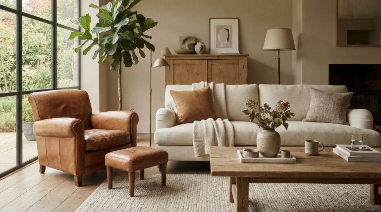
Smooth fabric sofas can look uninspired when everything matches the exact same cream swatch. Tossing a worn cognac leather pouf or caramel suede pillow into the mix introduces rich warmth that never feels loud. Leather patinas naturally with age, adding visual character that manufactured dyes cannot beat.
Thrift an aged leather armchair or add a stitched cognac leather cushion to your linen sofa. The warm tan undertones function as a neutral while providing a rich organic anchor. It breaks up monochromatic fabric monotony and makes your lounging area look effortlessly curated.
FAQs
Can a neutral home feel cozy without warm paint colors?
Yes, you can build immense coziness by layering tactile textures like chunky knits, tumbled stone, and unsealed woods. Combining multiple fabric weights and low, warm lighting prevents a neutral space from feeling clinical, even when your wall paint leans toward cool white or pale gray.
What are the best home decor tips for people who hate bright colors in small rooms?
Stick to a tight tonal range and maximize texture through ribbed glass, mirrors, and woven rugs. Using lighter neutral tones across walls and large furniture creates seamless sightlines, which makes compact spaces feel substantially larger while maintaining visual interest through varied materials.
How do I stop an all-neutral living room from looking boring?
Add high-contrast accents like blackened iron hardware, dark walnut furniture, or charcoal frames to break up the space. The contrast draws your gaze around the room, creating rhythm and depth so the eye never gets tired of the muted palette.
What wood tones work best for muted spaces?
White oak, natural ash, and rich walnut work best because their natural grain patterns offer plenty of movement. Avoid heavily tinted orange or red stains, which introduce unwanted fiery undertones that clash with quiet, muted interior schemes.
Conclusion
Creating a home you love never requires following loud design trends that make your head hurt. Stick to natural materials, heavy textures, and layered lighting to build a space that feels deeply restorative. What quiet texture are you planning to bring into your space this weekend?